FOURTH NINE WEEKS
Week 1
|
|
THU 4/14 - Final Form must be completed TODAY!
Week 2
FRI 4/22 - Final Surface must be complete by Monday, May 2!!!
Week 3
|
TUE 4/26 - Continue working on your sculpture - We will begin hanging on Monday of next week!
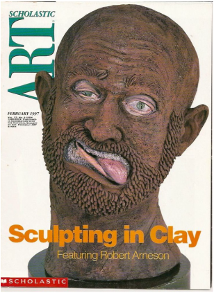
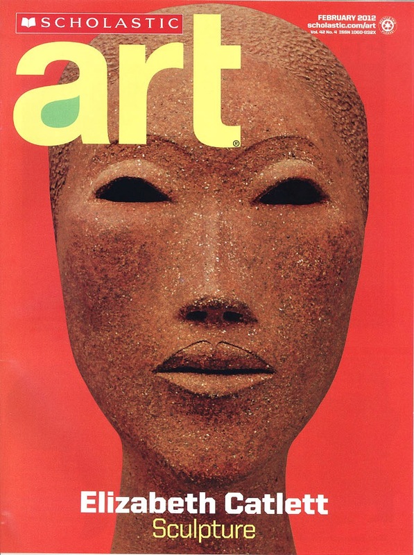
THU 4/28 Choose one HISTORIC CERAMIC work of art and one CONTEMPORARY CERAMIC to compare and contrast. Browse the selection of Scholastic Magazines provided on the counter to find these examples. In your Google Drive, create a new Google Slide in your B4 folder titled CERAMICS. You must include an image of each work, with a caption including: TITLE, DATE, ARTIST (Nationality of Artist or work), MEDIUM, DIMENSIONS Answer as many of the following questions as you can about each of the individual works of art. What do you see? List all the items you see in the art work. What is the main subject of the art work? Where is the subject located? How can you tell? What is this work of art about? Is there a message that goes beyond the subject matter? Does anything you see in this work of art remind you of something else you have seen or experienced? How does this work of art relate to you? Why do you think this artist created this work? How do you think this artwork was used by the people who made it? What was its function? Describe the composition of the art work. Describe the elements of art present in the work. Line, color, texture, space, etc. Describe the principles of art present in the work. Balance, emphasis, proportion, pattern, etc. Which area of the artwork is emphasized by the artist? Why? How does your eye move through the artwork? What choices did the artist make for this to happen? What is the mood of the art work? What do you like about this artwork? What do you dislike about this artwork? Now, begin to explain the similarities and differences you have discovered. |
|
Week 4
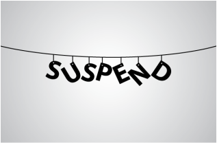
MON 5/2 - Complete your Suspend Sculpture!!
WED 5/4 - Prepare your Suspend Sculpture to hang!!
FRI 5/6 - Hang your Suspend Sculpture!!!!!
REMINDER: Please complete the Ceramics Assignment above if you have not already do so
WED 5/4 - Prepare your Suspend Sculpture to hang!!
FRI 5/6 - Hang your Suspend Sculpture!!!!!
REMINDER: Please complete the Ceramics Assignment above if you have not already do so
|
|
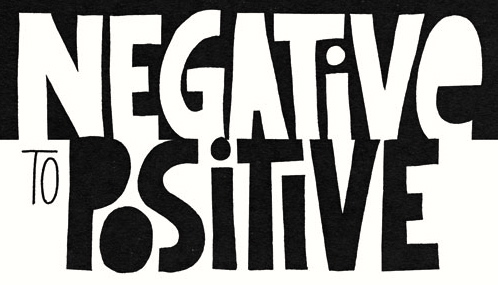
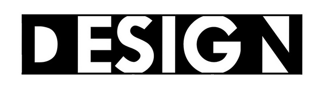
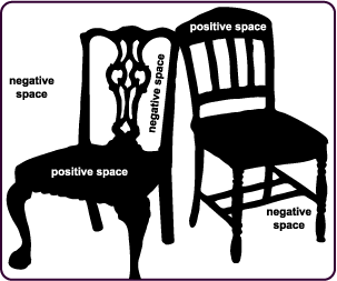
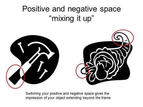
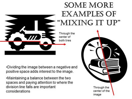
Objectives: The student will learn about the aspects of positive and negative space and be able to determine and recognize the differences between the two. The students will apply this knowledge to create a design that creatively utilizes negative and positive space.
|
Definitions:
Positive Space includes the shapes that define the main subject Negative Space includes the shapes that are between or surrounding the subject Just as important as that object itself, negative space helps to define the boundaries of positive space and brings balance to a composition. Successful designers interplay between positive and negative space. Examples in Logo Designs |
|
|
Requirements:
Tools - you can only use an x-acto knife and 1 piece of mat board to complete
Orientation - Horizontal, Vertical, Square, or Panoramic
Composition - Symmetrical or Asymmetrical - equal balance of black and white and making use of the entire space
Subject - must have more than one main subject, which must be recognizable though not necessarily realistic
Details - you must demonstrate small intricate cuts in your design that define elaborate patterns or textures
Creativity - this must be YOUR design and not a copy from someone else's drawing or interpretation of the subject
References - you must print 2+ reference PHOTOS of your subjects (NOT DRAWINGS) to complete your design
Week 5
TUE 5/10 - Complete Assignment Notes in Journal (copied from above)
THU 5/12 - Sketch ideas for Positive | Negative Design
THU 5/12 - Sketch ideas for Positive | Negative Design
Week 6
MON 5/16 - Print two photo references
WED 5/18 - Label Mat board with your name and trace onto drawing paper for final design (no line drawings - shapes ONLY!)
FRI 5/20 - Transfer final design to your mat board using carbon paper method
WED 5/18 - Label Mat board with your name and trace onto drawing paper for final design (no line drawings - shapes ONLY!)
FRI 5/20 - Transfer final design to your mat board using carbon paper method
Week 7
TUE 5/24 - Carving Day 1
THU 5/26 - Carving Day 2
THU 5/26 - Carving Day 2
Week 8
TUE 5/31 - Carving Day 3 / Prepare for Final Exam Project (Construct Books)
THU 6/2 - Carving Day 4 / Prepare for Final Exam Project (Print References & Plan)
THU 6/2 - Carving Day 4 / Prepare for Final Exam Project (Print References & Plan)
Week 9
MON 6/8 - Begin Final Exam Book Project - Plan (40 minutes) + 2 compositions (40 minutes)
WED 6/8 - Continue Final Exam Book Project (4 Compositions - 20 minutes each)
FRI 6/10 - Continue Final Exam Book Project (4 Compositions - 20 minutes each)
WED 6/8 - Continue Final Exam Book Project (4 Compositions - 20 minutes each)
FRI 6/10 - Continue Final Exam Book Project (4 Compositions - 20 minutes each)
|
The Book Project Requirements:
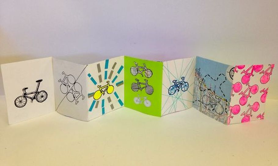
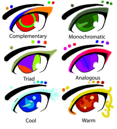
Subject: Choose one object to repeat throughout your accordion book. You will need a reference to design this object yourself (you cannot use anyone else's design). Materials: Use at least 3 different materials including graphite, charcoal (with spray fixative), colored pencil, chalk pastel (with spray fixative), watercolor, pen, and collage Color schemes: Use at least 3 different color schemes including complementary, monochromatic, triad, analogous, cool and warm. Compositions: Create 12 separate compositions. The 6 elements of art should be the main focus of each individual page on the front side of the accordion book. These include 1. Line, 2. Shape, 3. Form, 4. Space, 5. Value, 6. Texture. The principles of design including 7. Pattern, 8. Emphasis, 9. Balance,10. Contrast, 11. Proportion, 12. Movement must be demonstrated on the reverse side. There should be no text inside the accordion book, except your name inside the front cover, the year inside the back cover, and numbered pages. Cover: You should title your book the name of your object. For instance, the one to the left would be titled Bicycles or Bikes. The cover can be created using the mat board cut out technique from the positive/negative project. Deadline: This accordion book must be completed prior to the start of your final exam. On exam day, you will complete a written assignment connected to this final project. To complete this exam, you must come prepared with a solid understanding of all 12 elements and principles of design and 6 color schemes. |
FINAL EXAM
THU 5/16- Complete Final Exam Book Project (2 Compositions - 40 minutes)
Complete Cover Design (20 minutes) and Table of Contents (60 minutes): On separate paper, include Name + Year + List of Page#’s + Description: define the design element/principle + explain how composition aligns with this definition + color scheme - NO NOTES!
Complete Cover Design (20 minutes) and Table of Contents (60 minutes): On separate paper, include Name + Year + List of Page#’s + Description: define the design element/principle + explain how composition aligns with this definition + color scheme - NO NOTES!
THIRD NINE WEEKS
Week 1
MON 2/8 - Fininsh carving the drypoint plate
WED 2/10 - Print a proof of your plate, and continue carving as needed
FRI 2/12 - Print 4 final editions on white paper (at least one should be wiped completely clean then experiment with wiping)
Select two other surfaces to print on (including fabric, wall paper, or colored paper of your choice - avoid dark patterns and/or colors)
Week 2
|
WED 2/17 - Print on 2 additional surfaces
Choose one print on white paper to add any media your choice THU 2/18 - ART GUILD FRI 2/19 - Work on completing this series of prints (due next week) Final Printmaking Requirements: 1. Print on white paper wiped completely clean 2. Print on white paper with experimental inking/wiping 3. Print on white paper with your choice of added media 4. Print on white paper with color pencils added to enhance color, texture, detail, and depth (this is NOT a coloring book page!) *Choose a dominant color scheme: complementary, monochromatic, triad (primary/secondary/tertiary),analogous, cool, or warm 5.Print on surface of your choice 6. Print on surface of your choice (added media optional) |
|
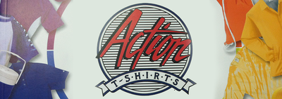
SATURDAY 2/20 @ 10am - 1pm
STUDIO VISIT!!!!
Eric Helm @ Action T-Shirts
2926 W. Marshall St. Richmond, VA 23230
The screen printing shop is a block from the corner of Broad St. and Boulevard, in Scotts Addition. Parking is directly across the street.
STUDIO VISIT!!!!
Eric Helm @ Action T-Shirts
2926 W. Marshall St. Richmond, VA 23230
The screen printing shop is a block from the corner of Broad St. and Boulevard, in Scotts Addition. Parking is directly across the street.
Week 3
TUE 2/23 - All 4 prints on white paper due
THU 2/25 - 2 prints on other surfaces due
THU 2/25 - 2 prints on other surfaces due
Week 4
MON 2/29 - ALL 6 PRINTS MUST BE TURNED IN TO BE EVALUATED - Optional: Vans Designs or Prepare Room for Sculpting

|
WED 3/2 - Journal Entry Title: SUSPEND SCULPTURE Materials: Paper Mache & Wire Requirements: 1. CONCEPT: Your sculpture must be designed to creatively hang from the ceiling. For instance, the figure or object could be flying, floating, swimming, falling, reaching, or climbing. 2. FORM: Your sculpture must be representational as apposed to abstract. It can be imaginary or stylized, but it MUST be based on of real subject matter. |
(Journal Entry Continued)
Planning: Now divide the rest of your paper in half - Above The left column write CONCEPT and above the right column write FORM - Work through at least three separate ideas (use additional journal pages as needed). CONCEPTS should be explained in writing, and the FORMS should be drawn out using thumbnail sketches. We will be choosing your strongest CONCEPT AND FORM, then begin saving/printing references for your final sketches.
FRI 3/4 - Print References (3 or more) for your BEST CONCEPT & FORM then complete 3 FINAL SKETCHES in your Journal
TURN IN YOUR JOURNAL AT THE END OF CLASS FOR GRADING!
Research Links:
Ai Wei Wei's Paper Dragons
Paper Mache Tutorials
THU 3/3 - Vans Custom Culture Contest Designs Due!!
FRI 3/4 - Printed references due - begin final sketches
Planning: Now divide the rest of your paper in half - Above The left column write CONCEPT and above the right column write FORM - Work through at least three separate ideas (use additional journal pages as needed). CONCEPTS should be explained in writing, and the FORMS should be drawn out using thumbnail sketches. We will be choosing your strongest CONCEPT AND FORM, then begin saving/printing references for your final sketches.
FRI 3/4 - Print References (3 or more) for your BEST CONCEPT & FORM then complete 3 FINAL SKETCHES in your Journal
- Draw your 1st FINAL SKETCH of your Suspend Sculpture to Scale from a straight on view (DUE TODAY)
- It must have one 10in dimension either height or width - so draw vertical or horizontal and FILL the page!
- YOU MUST USE YOUR PRINTED REFERENCES!
- Draw your 2nd FINAL SKETCH of your Suspend Sculpture to Scale from a rear view
- Draw your 3rd FINAL SKETCH of your Suspend Sculpture from a bird's eye or worm's eye view
TURN IN YOUR JOURNAL AT THE END OF CLASS FOR GRADING!
Research Links:
Ai Wei Wei's Paper Dragons
Paper Mache Tutorials
THU 3/3 - Vans Custom Culture Contest Designs Due!!
FRI 3/4 - Printed references due - begin final sketches
Week 5
TUE 3/8
Paper Mache Tutorials: Making Wire Armature with Cardoard, Foil and Wire , Paper Mache Armature with Crumpled Newspaper and Tape
THREE FINAL SKETCHES DUE TODAY
- Draw your 1st FINAL SKETCH of your Suspend Sculpture to Scale from a straight on view
- It must have one 10in dimension either height or width - so draw vertical or horizontal and FILL the page with the main form!
- YOU MUST USE YOUR PRINTED REFERENCES TO DRAW!
- Tape fold outs in your Journal if additional parts extend from the main form
- Draw your 2nd FINAL SKETCH of your Suspend Sculpture to Scale from a rear view
- Draw your 3rd FINAL SKETCH of your Suspend Sculpture from a bird's eye or worm's eye view
SECOND NINE WEEKS
Week 1
TUES 11/10
Prepare your final painting composition:
Step 1 - Complete Collage - Have it photo copied to reduce the values - Draw on the photocopy to outline the basic shapes - Use colored pencils to define where your two dominant paint colors will be placed
Step 2 - Transfer shapes to canvas
Step 3 - Use paint colors to apply a thin layer of each color in the corresponding shapes
THU 11/12
Continue Step 2 & 3
Step 4 - Add finer detail shapes to continue paint layers - PROGRESS CHECKPOINT!!
Week 2
KEY TERMS:
Step 5 - On back of your Color Mixing Chart, list 2 highlight values, 2 midtone values, and 2 shadow values with formulas using class set
Step 6 - Continue adding layers of midtone values - then shadows, then highlights
- Mid Tones: The midtone is usually going to be the majority tone that is visible, the highlights and shadows are usually a smaller part of the tonal range
- Shadow: Shadows can have really sharp edges between it and the midtone or it can just sort of gradually blend into the midtone. How the shadow looks depends entirely on the surface of the object and also the quality of the light.In addition to the shadows on the object itself, there's also the cast shadow.
- Highlight: The highlight is a reflection of the actual light source on the subject
Step 5 - On back of your Color Mixing Chart, list 2 highlight values, 2 midtone values, and 2 shadow values with formulas using class set
Step 6 - Continue adding layers of midtone values - then shadows, then highlights
Week 3
TUE 11/24 - PAINTING
Week 4
TUE 12/1 - PAINTING (Background Due)
THU 12/3 - PAINTING - ART GUILD
THU 12/3 - PAINTING - ART GUILD
Week 5
MON 12/7 - PAINTING
WED 12/9 - PAINTING
FRI 12/11 - CONTEMPORARY CUBIST PAINTING DUE!!
(View your grading rubric and teacher reflections on Google Drive - go to "Shared With Me" and you will see B4 GRADING RUBRICS)
STUDENT REFLECTIONS: (Add your response on a new Google Doc in your B4 folder that is shared with me)
Please write a short paragraph that tells a story about your main character within the painted setting. Explain what is happening in the scene you constructed relating to the secondary characters as well.
Week 6
TUE 12/15 - Complete Painting Narratives in Google Drive (See Instructions Above)
Introduction to Printmaking
Introduction to Printmaking
|
What is printmaking? Printing is the process of transferring ink from matrix to paper, and, except in stencil and digital printing, the image on the paper appears backwards from the way it is on the matrix.
What is the importance of printmaking? Drawing and painting are special because they can take a long time to create and because they are originals. Printmaking makes artwork available to the general public because multiples prints can be made of one artwork. |
|
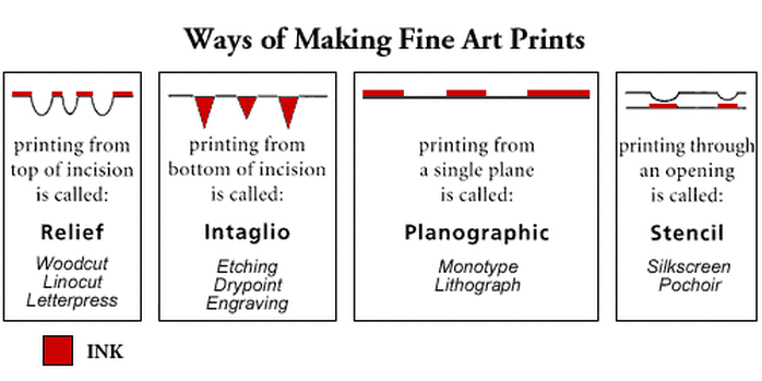
What are differences between these printmaking processes?
1. Relief - In relief printing, the matrix is made by carving away whatever is not supposed to be printed.
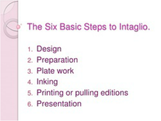
2. Intaglio - (in-TAL-ee-oh) comes from the Italian word intagliare, meaning, “to incise.” - the marks are incised into a surface creating sunken areas that will hold ink for printing
3. Planographic - this is surface printing on a two-dimensional plane - the areas that print are chemically differentiated from the areas that are to remain ink free (for instance, oil and water don't mix)
4. Stencil - the ink is pressed through a part of the surface that has been cut away
1. Relief - In relief printing, the matrix is made by carving away whatever is not supposed to be printed.
2. Intaglio - (in-TAL-ee-oh) comes from the Italian word intagliare, meaning, “to incise.” - the marks are incised into a surface creating sunken areas that will hold ink for printing
3. Planographic - this is surface printing on a two-dimensional plane - the areas that print are chemically differentiated from the areas that are to remain ink free (for instance, oil and water don't mix)
4. Stencil - the ink is pressed through a part of the surface that has been cut away
|
Printmaking Vocabulary:
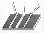
Drypoint - is the simplest form of intaglio and was traditionally done on a metal plate, but can also be done on an acrylic, plastic or Plexiglas plate. Etching into the plate will create a burr or an area that stands up from the plate a bit. This is going to help hold the ink and create a good print. Each time the plate is printed, the burr will be worn down just a bit. The technique is not the best one for large editions as after 15 prints there will be a significant decline in the ability of the plate to hold the ink and print. Matrix - The source, the plate or block from which the prints originate. Impression - A single copy printed from a matrix Proofs - Working proofs are made before the artist completes work on the image and usually exist in only one impression. Because they are unfinished, artists usually keep them from the market by not signing them. Edition – A series of copies of an original work of art. Editions are those prints pulled from the same matrix and inked in the same way that are put up for sale. There are a limited number of prints that can range from two impressions to hundreds. Editions do not include proofs (the prints saved by the artist, printers and publisher). After the edition is printed, the matrix is destroyed to ensure that no more prints are pulled from the plate. These fine art prints are considered multiple originals, not reproductions. Numbering System - Edition prints are each marked with what looks like a fraction: 19/35 for example.The bottom number refers to the total number of impressions in the edition and the top number refers to the specific impression it identifies. The top numbers are merely serial numbers, they do not represent any ranking in terms of quality or chronological order in which they were printed. Signature and Chop - An artist's signature on a print means the artist has approved it and acknowledges it as his or her work. The signature may be on the back of the print instead of the front. Another guarantee of quality is the publisher's identifying chop. This is often an embossed seal imprinted in the piece. If you can't find a chop embossed into the print, it may have a stamp on the back. |
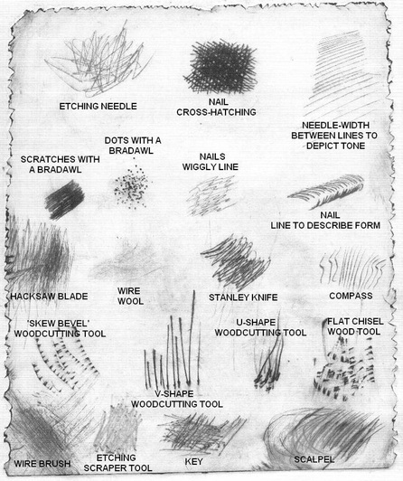
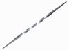
TEXTURES CREATED BY VARIOUS ENGRAVING TOOLS
|

Printmaking Artists: The Inspired Line - From Durer to Rembrandt to Degas
Although they created their prints centuries and worlds apart, there are significant and remarkable connections between these artists.
Albrecht Dürer (German, 1471-1528)
At a young age, Dürer was trained as a metalworker by his father in Nuremberg, Germany. Later, Dürer applied the same exacting methods to his woodcuts and engravings. His strong admiration for Leonardo da Vinci and the Italian Renaissance led him to become the father of the Northern European Renaissance.
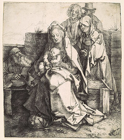
|
The Holy Family with Saint John, the Magdalene, and Nicodemus, 1512
Produced by scratching the surface of the metal with a sharp needle, the image has the character of a delicate drawing. Apparently conceived in an experimental mode and never completed, the print is nonetheless highly evocative. The three ghostly figures who press into the space behind the Virgin and Child—Saint John, the Magdelene, and Nicodemus—do not belong to the story of Christ's childhood but, as witnesses to the Crucifixion, are a presentiment of his future suffering. The soft shadow produced by the drypoint burr shrouds the figures and deepens the melancholy atmosphere. |
|
Rembrandt Harmensz van Rijn (Dutch, 1601-1669)
Beginning his career as a scholar, Rembrandt imbued his portraits with psychological depth and masterly light and shadow. At the height of his career, he was the most successful artist of the Baroque era. He was a highly accomplished etcher who created unique, profound interpretations of biblical stories.
Beginning his career as a scholar, Rembrandt imbued his portraits with psychological depth and masterly light and shadow. At the height of his career, he was the most successful artist of the Baroque era. He was a highly accomplished etcher who created unique, profound interpretations of biblical stories.
|
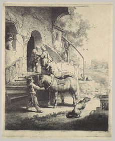
The Good Samaritan, 1633
This etching depicts the final scene in the parable of the Good Samaritan (Luke 10:25–37) in which the Samaritan stopped to help a traveler who had been attacked by robbers. Here he has brought the wounded man on horseback to an inn and pays for the man's care and lodging. This is one of two etchings in which Rembrandt reproduced his own paintings. The Good Samaritan repeats with a number of variations the composition of his painting in the Wallace Collection, London. Among Rembrandt's additions here to the largely empty foreground that appeared in the painting is the defecating dog that adds a note of everyday reality to the biblical scene. |
|
"Rembrandt was fascinated with subjects from the Old and New Testaments and, enjoyed revealing the realistic human emotion and narrative detail inspired by these stories."
Rembrandt created some 300 etchings and drypoints from about 1626 to 1665. Above all, he was a great innovator and experimenter in this medium, often handling traditional materials in unconventional ways. Rembrandt first tried his hand at creating larger, highly finished prints related to paintings like The Good Samaritan (above), but by the 1650s, Rembrandt began to treat the printing plate much like a canvas—leaving some ink or tone on the surface of the printing plate in order to create "painted" impressions of prints in which each impression would look different depending on the way he had inked the plate. For example, The Entombment (below) was printed in the first state without plate tone so that only the etched lines are visible. In the second state, however, he produced subtle, moody impressions of the same image by leaving a good deal of ink on the surface of the printing plate and then wiping it away in certain areas to create highlights.
Rembrandt created some 300 etchings and drypoints from about 1626 to 1665. Above all, he was a great innovator and experimenter in this medium, often handling traditional materials in unconventional ways. Rembrandt first tried his hand at creating larger, highly finished prints related to paintings like The Good Samaritan (above), but by the 1650s, Rembrandt began to treat the printing plate much like a canvas—leaving some ink or tone on the surface of the printing plate in order to create "painted" impressions of prints in which each impression would look different depending on the way he had inked the plate. For example, The Entombment (below) was printed in the first state without plate tone so that only the etched lines are visible. In the second state, however, he produced subtle, moody impressions of the same image by leaving a good deal of ink on the surface of the printing plate and then wiping it away in certain areas to create highlights.
|
|
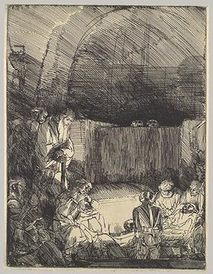
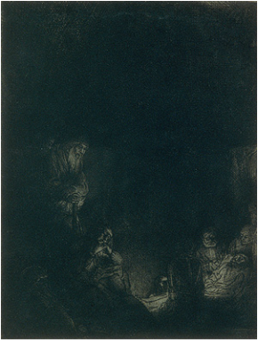
Entombment, 1654
The startling difference between this impression (right) and the impression of the first state (left) has less to do with the many hatched lines Rembrandt added to the composition in the second state than with the veil of ink he left on the copperplate as it was printed. This ink turns the previously brightly lit scene into a dark one in which only the faces and hands of the central figures are illuminated. By initially leaving this tone on the copperplate and wiping away the ink only where he wanted to leave touches of light, Rembrandt printed both the etched lines and the layer of ink left on the surface. As a result of this exceptional painting of the plate before printing, each impression Rembrandt pulled was unique. |
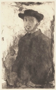
Edgar Degas (French1834–1917)
Edgar Degas was born in Paris and briefly received a conventional art education based on traditional techniques and subject matter. His early work often centered on standard, historical subjects, based on his study of past masters. In his late twenties he began to paint contemporary city life, and he became one of the founding members of the Impressionist group. His work was often radically experimental in form, but perhaps thanks to his early training, he maintained an interest in traditional subjects like portraiture for many years.
Degas visited museums and private collections while in Italy, and spent time with other French artists who were living there. Degas’ growing interest in the medium of etching stemmed from his appreciation of Rembrandt's works—the preeminent practitioner of etching up to that time. Degas made a direct copy of an etching by Rembrandt, which, together with another print, a self-portrait by the Dutch artist, inspired his portrait of Tourny. Degas’s compositional borrowings, as well as his adoption of the multi-stage process of creating an image on the etching plate (prints made at each stage being referred to as “states”), indicate his active desire to learn from Rembrandt’s example.
|
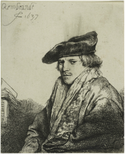
Rembrandt's Drypoint Print (1637)
|
|
|
DRYPOINT DESIGN REQUIREMENTS:
|
Sources:
http://centralpt.com/upload/417/15224_PrintmakingLessonPlans.pdf
http://www.crownpoint.com/page/printmaking
http://wps.prenhall.com/wps/media/objects/259/265596/sayre4IM/ch_11.pdf
http://www.kenneymencher.com/2015/06/16th-c-printmaking-reformation-durer.html
http://www.slideshare.net/jaysartclass/printmaking-41031881
THU 12/17 - Design your print
Week 7
MON 1/4
WED 1/6
THU 1/7 - ART GUILD
FRI 1/8
WED 1/6
THU 1/7 - ART GUILD
FRI 1/8
Week 8
TUE 1/12 - Final Drypoint Designs Due
THU 1/14
THU 1/14
Week 9
TUE 1/19 - Complete Final Drypoint Design
THU 1/21 - I will collect your Final Drypoint Design for Grading now
We will begin carving the printmaking plate on day 1 of the second semester
TODAY we will begin your EXAM REVIEW: Topic - Elements and Principles of Design
Choose one artwork from the Virginia Museum of Fine Arts Permanent Collection
Conduct research on the piece and the artist who created it to investigate the story behind its making.
You can use these resources:
On a google doc in your B4 folder, place the image & citation (artist, date, title, medium, size, VMFA collection)
In 3-5 sentences, explain the narrative behind your chosen artwork.
In 6-10 sentences, describe three elements and three principles of design that are evident in the work.
Study the definitions of these Elements and Principles of Design to be prepared for your midterm exam on Friday.
Extra Credit: Visit the piece in person and bring back a selfie to add to the bottom of this Google Doc
Deadline: March 24th (last Art Guild Meeting)
MIDTERM EXAM
MON 1/25 - Regular Block
FRI 1/29 - Exam Block
FRI 1/29 - Exam Block
FIRST NINE WEEKS
Week 1
The Five Basic Skills of Drawing
1 THE PERCEPTION OF EDGES
2 THE PERCEPTION OF SPACES
3 THE PERCEPTION OF RELATIONSHIPS
4 THE PERCEPTION OF LIGHT AND SHADOWS
5 THE PERCEPTION OF THE WHOLE, OR GESTALT
Logical Progression: From Line to Value to Color to Painting
1 THE PERCEPTION OF EDGES
2 THE PERCEPTION OF SPACES
3 THE PERCEPTION OF RELATIONSHIPS
4 THE PERCEPTION OF LIGHT AND SHADOWS
5 THE PERCEPTION OF THE WHOLE, OR GESTALT
Logical Progression: From Line to Value to Color to Painting
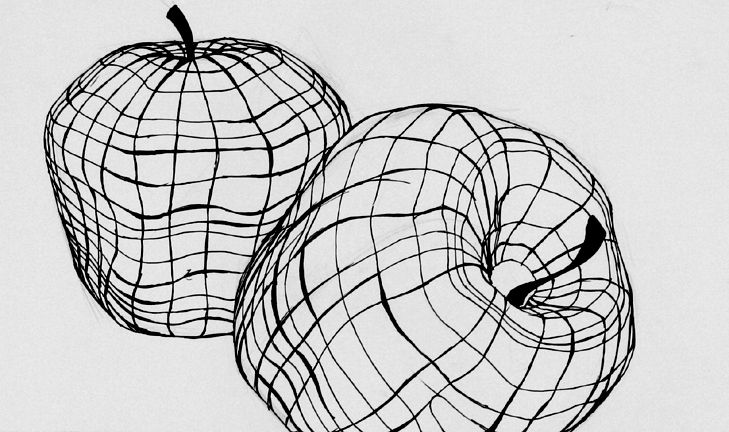
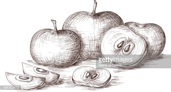
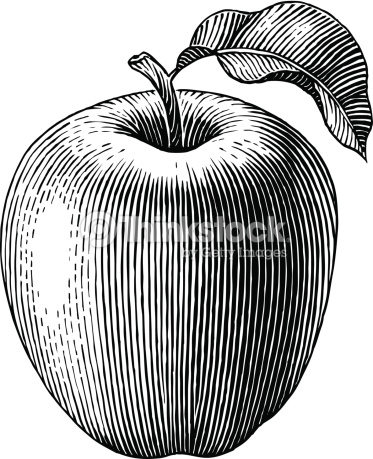
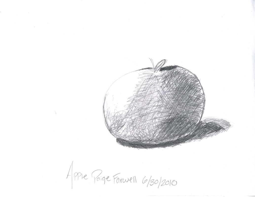
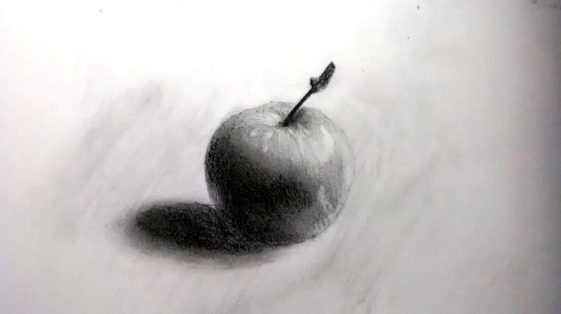
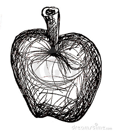
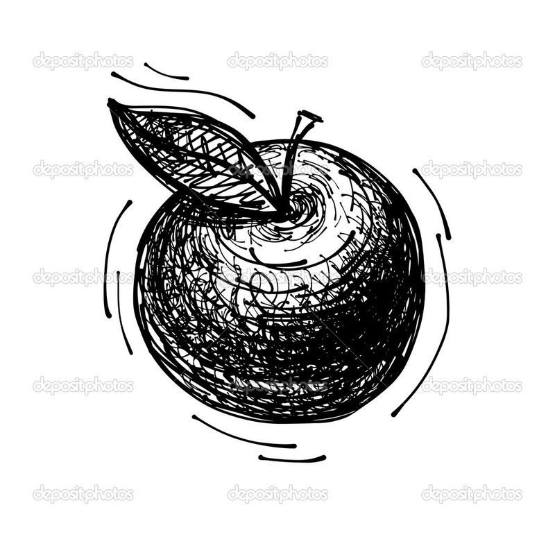
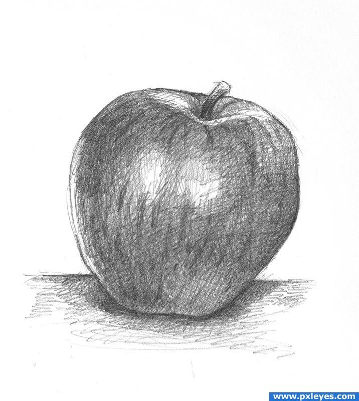
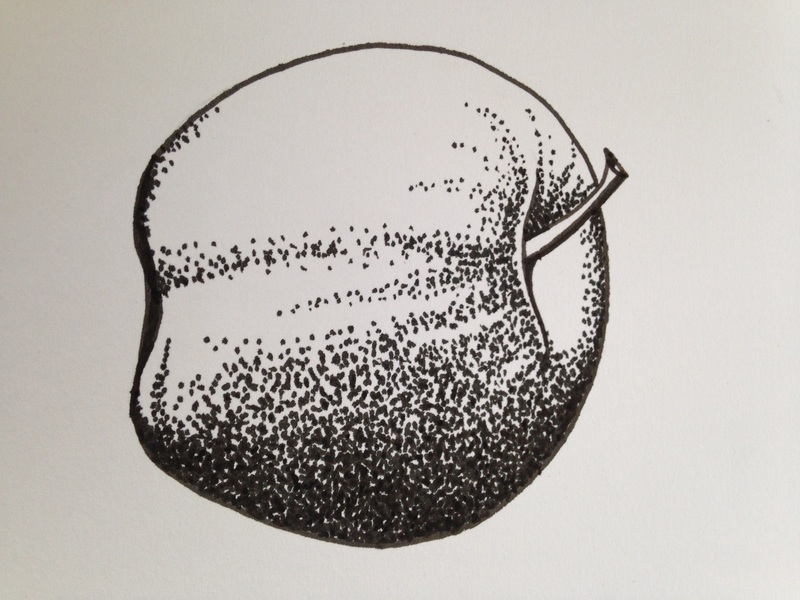
Apples to Apples
Drawing Exercise 1: Create 6 different variations of an apple drawn from life - you must emphasize the use of line and change the composition - all grayscale


Week 2

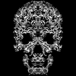
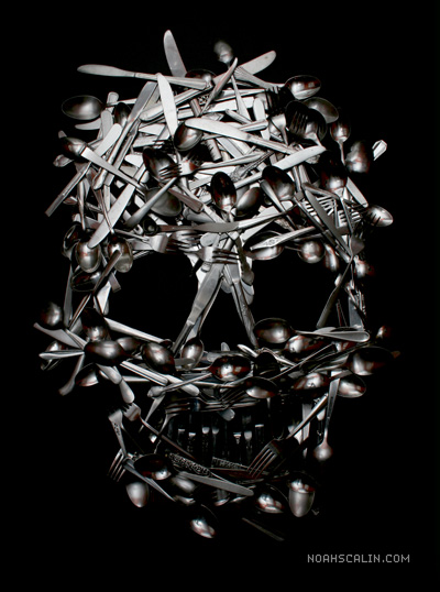
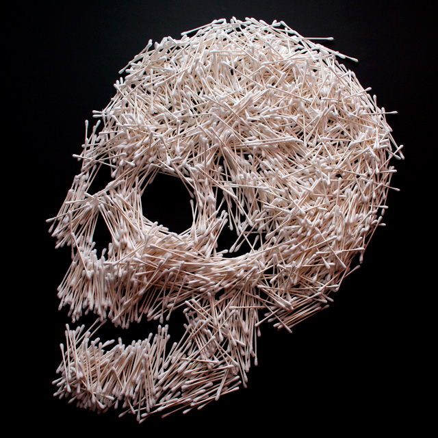
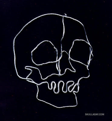
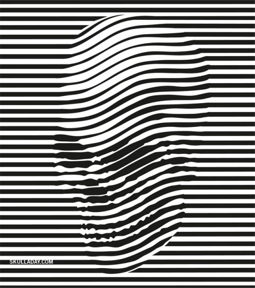
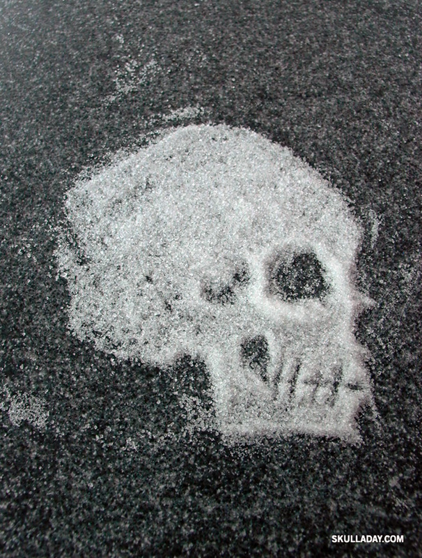
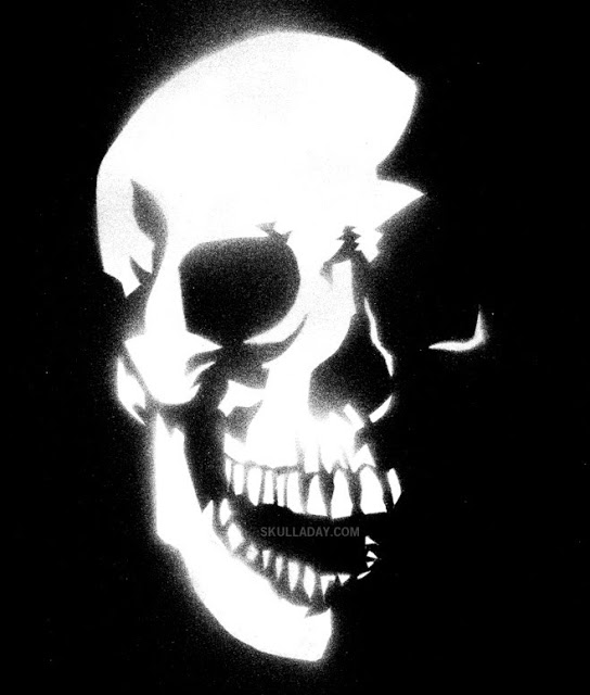
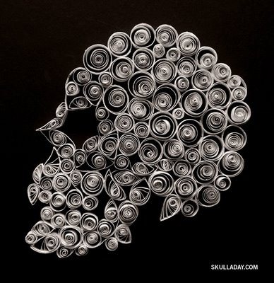
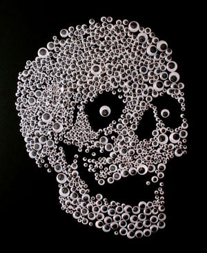
Artist: Noah Scalin's Skull-A-Day Project http://skulladay.blogspot.com/
Skull-A-Day is the creation of artist Noah Scalin. It began on June 4, 2007 as a personal daily art project and went on to become an international community of skull fans sharing their art. The site was edited by Abby Davis, Justin "Tatman" Lovorn, and Citizen Agent between 2009 and 2014. This blog is now an archive of the complete project from 2007 – 2014.
Skull-A-Day is the creation of artist Noah Scalin. It began on June 4, 2007 as a personal daily art project and went on to become an international community of skull fans sharing their art. The site was edited by Abby Davis, Justin "Tatman" Lovorn, and Citizen Agent between 2009 and 2014. This blog is now an archive of the complete project from 2007 – 2014.


HW = Bring in one object from home that has personal significance - Challenge yourself with the complexity of the object, but don't bring in something that will overwhelm you - we are trying to keep it simple and recognizable - We will be working with this object for several weeks to create 12 different of grayscale compositions - Consider keeping it in your locker so you can bring it to class daily!
Drawing Exercise 2: Create 6 different variations of your own still life object - you must vary your use of line, media, and composition - all grayscale
Drawing Exercise 2: Create 6 different variations of your own still life object - you must vary your use of line, media, and composition - all grayscale
Week 3
Week 1-3 Journal Entries:
Page 1 - Label Week 1 at the top. Use the front and back to compare and contrast your strongest apple to your weakest apple. Tape one drawing at the top of each page and write at least THREE SENTENCES below it. Explain your use of LINE, MEDIA, and COMPOSITION for each one. USE DESCRIPTIVE WORDS LISTED HERE!
Page 2 - Label Week 2 at the top. Tape your strongest example for the second object on the front and the weakest example on the back. Repeat the same written response above. (The other 8 drawings should be placed in the back of your journal).
Page 3 - Label Week 3 at the top. Create at least three thumbnail sketches for your final project ideas. Choose the best one and explain why this is the best approach.
First Project: Create a single composition using at least three different views of the same still life object
Week 4
Complete Week 3 Journal Entry & Turn In
Get teacher feedback on best composition & finalize planning
Receive brown paper and sketch the contour of your objects with HB pencils - minimize erasing to avoid damage
You must draw each view of your object from life - remember to look up!! - this is the foundation of your drawing so be precise
Get teacher feedback on best composition & finalize planning
Receive brown paper and sketch the contour of your objects with HB pencils - minimize erasing to avoid damage
You must draw each view of your object from life - remember to look up!! - this is the foundation of your drawing so be precise
Week 5

Journal Heading: Week 4 and 5
Journal Instructions:
Journal Instructions:
- Tape your Value Scale into your journal
- List 6 or more drawing materials used to create the darkest values to the lightest values
- Include a nice bold drawing of the word value and the following definition:
Week 6
MON 10/12 - FRI 10/16 - Work on Still Life Drawing Values: work from highlights to grey tones (brown paper is your middle value!)
Week 7
TUE 10/20 - Work on darkest values in your Still Life Drawing
THU 10/22 - FINAL DEADLINE FOR YOUR STILL LIFE DRAWING!
ACRYLIC PAINT EXERCISE: Color Mixing Charts
THU 10/22 - FINAL DEADLINE FOR YOUR STILL LIFE DRAWING!
ACRYLIC PAINT EXERCISE: Color Mixing Charts
Week 8
MON 10/26
ACRYLIC PAINT EXERCISE: Color Mixing Charts - Turn in one or two completed charts with your name on the back
ACRYLIC PAINT EXERCISE: Color Mixing Charts - Turn in one or two completed charts with your name on the back

Set up Google account
www.google.com - Sign In USERNAME = student#@hcps.us PASSWORD = birthday (ex: 11221999) Change Password - WRITE IT DOWN! |

|
RESEARCH EXERCISE: Journal + Google Drive
- Journal Heading = Week 8 - This is due by next Wednesday 11/4 (complete at home to tape in your journal!)
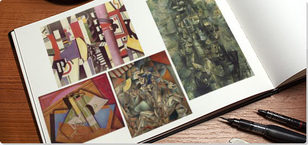
- Step 1: Define Cubism with dates
- Step 2: List prominent artists that influenced this movement with a description of their visual styles
- Step 3: Google Drive - Save 3-5 examples in your B4 folder / Journal - Write the artist name, title, date, size, and medium for each
- Step 4: Find 1 contemporary artist whose work shows an influence from cubist art and describe their use of the style in your Journal
WED 10/28
Ryan Gothrup Glass Blowing Demonstration
Ryan Gothrup Glass Blowing Demonstration
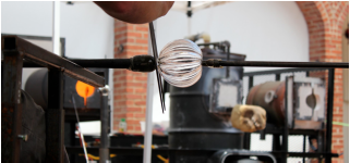
Journal Entry: Heading - Ryan Gothrup Glass Blowing Demonstration
DRAWING EXERCISE:
- Include at least one sketch and three comments about what you learned from seeing this artist at work.
DRAWING EXERCISE:
- Blind contour drawing- contains lines that are drawn without ever looking at the piece of paper. This forces you to study a scene closely, observing every shape and edge with your eyes, as your hand mimics these on paper.
- Gesture drawing- completed quickly using fast, expressive lines. Gesture drawings capture basic forms, proportions, emotion, and essence of a subject without focusing on detail.
- Continuous line drawing- produced without ever lifting the drawing instrument from the page.
- Contour drawing- shows the outlines, shapes and edges of a scene, but omits fine detail, surface texture, color and tone
FRI 10/30
COLOR NOTES:
Week 9
Dana Schutz PowerPoint
WED 11/4
Gesso 14x18” paper for painting
Complete your color grid
Key Terms:
FRI 11/6
Continue working on Collage
Gesso 14x18” paper for painting
Complete your color grid
- Choose a warm and cool color and work through the gradation values of tints, shades, and blends
- The two prominent colors chosen in the color grid
- 1-2 main characters (mostly focusing on the bust and above)
- A background element to show perspective
- A physical distortion to the main character(s)
- An obvious pattern anywhere on the collage
Key Terms:
- Gesso: to protect the support from the paint, some of which contain components that could damage it, provides the key (surface) for the paint to stick to, and affects the absorbency of the support.
- Collage: a technique of composing a work of art by pasting on a single surface various materials not normally associated with one another, as newspaper clippings, or parts of photographs.
- Perspective: In drawing or painting, a way of portraying three dimensions on a flat, two-dimensional surface by suggesting depth or distance.
FRI 11/6
Continue working on Collage
