FOURTH NINE WEEKS
Site-Specific Installations
As a site-specific work of art is designed for a specific location, if removed from that location it loses all or a substantial part of its meaning. Outdoor site-specific artworks often include landscaping combined with sculptural elements (the movement is linked with Environmental art). Indoor site-specific artworks may be created in conjunction with (or indeed by) the architecture of the building.
Much of the art of the past was site specific,created specifically for a certain building, often commissioned by the Church, like the fresco by Michelangelo in the Sistine Chapel, the sculptures on a Medieval Cathedral facade or the recently destroyed Buddhas of Bamiyan, carved into a wall of rock in Afghanistan. However, the idea of site-specific art became very prominent in the 1960s. Artists emphasized that the physical location and surroundings of an artwork were inseparable from its identity. This concept arose as a result of these artists’ increasing interest in the physical contexts of their artmaking, specifically how different contexts could change (and more importantly, complicate) the experience of an artwork.
Much of the art of the past was site specific,created specifically for a certain building, often commissioned by the Church, like the fresco by Michelangelo in the Sistine Chapel, the sculptures on a Medieval Cathedral facade or the recently destroyed Buddhas of Bamiyan, carved into a wall of rock in Afghanistan. However, the idea of site-specific art became very prominent in the 1960s. Artists emphasized that the physical location and surroundings of an artwork were inseparable from its identity. This concept arose as a result of these artists’ increasing interest in the physical contexts of their artmaking, specifically how different contexts could change (and more importantly, complicate) the experience of an artwork.
|
Kara Walker
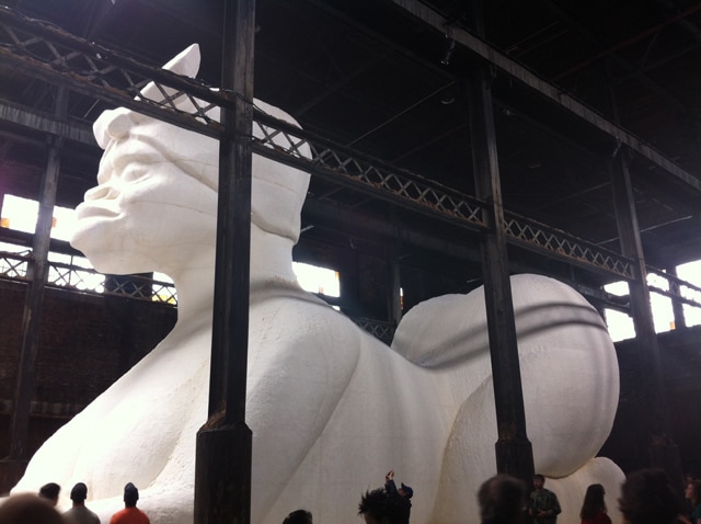
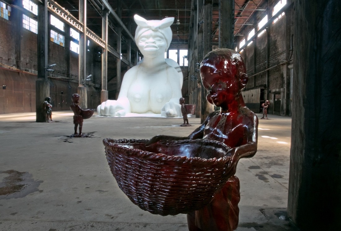
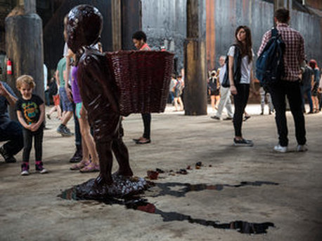
Subtlety, 1997 Poystyrene coated in sugar and molasses molds 35ft x 15ft x 50ft Brooklyn New York A massive sphinx-turned-mammy, she stands mute, looking outward, acting perhaps as a guardian, perhaps a monument, perhaps, like the Greek sphinx of old, a devouring female terror. Presiding over the cavernous Domino building in seeming repose, Walker’s sphinx is a hybrid of two distinct racist stereotypes of the black female: She has the head of a kerchief-wearing black female, referencing the mythic caretaker of the domestic needs of white families, especially the raising and care of their children, but her body is a veritable caricature of the overly sexualized black woman, with prominent breasts, enormous buttocks, and protruding vulva that is quite visible from the back. If this evocation of both caregiver and sex object—complicated by her coating in white sugar—feels offensive, it is meant to. It is part of what Walker has come to be known for. Surrounding the massive center sculpture are 5 foot tall boys carrying baskets made entirely out of molassas colored candy They're cute and apple-cheeked, but they're also kind of scary as they slowly melt into pools that look a lot like blood. She's doing what she does best: drawing you in with something sweet, something almost charming, before you realize you've admired something disturbing. In this case, that's the horror-riddled Caribbean slave trade that helped fuel the industrial gains of the 18th and 19th centuries; a slave trade built to profit from an insatiable Western market for refined sugar treats and rum. "Basically, it was blood sugar," Walker says. "Like we talk about blood diamonds today, there were pamphlets saying this sugar has blood on its hands." She explains that to make the sugar, the cane had to be fed into large mills by hand. It was a dangerous process: Slaves lost hands, arms, limbs and lives. http://creativetime.org/projects/karawalker/curatorial-statement/ Doris Salcedo - 1,550 Chairs Stacked Between Two City Buildings, 2003
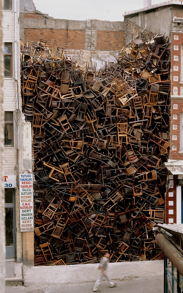
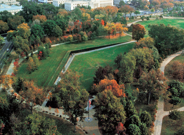
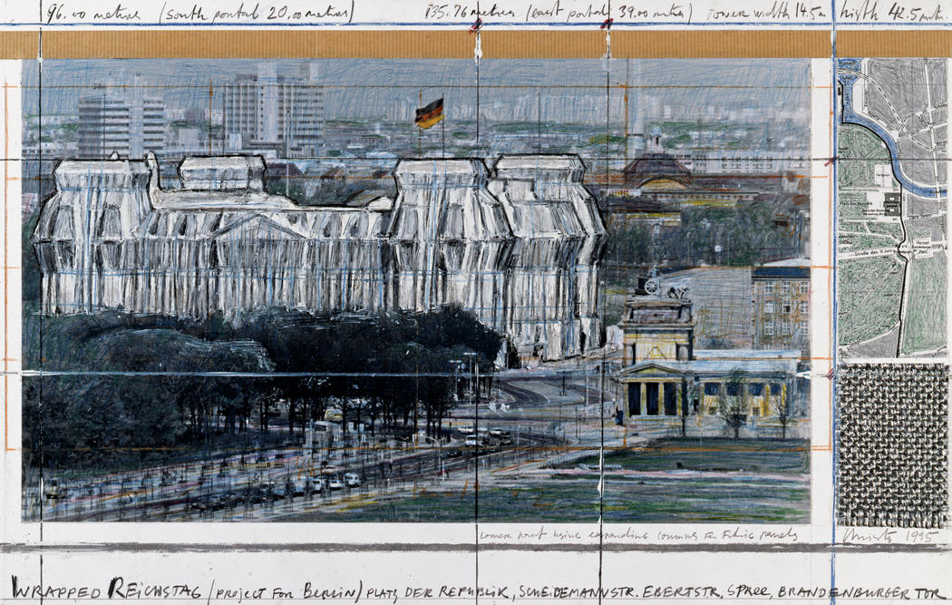
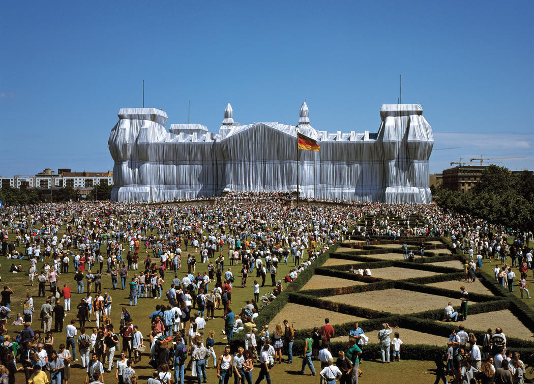
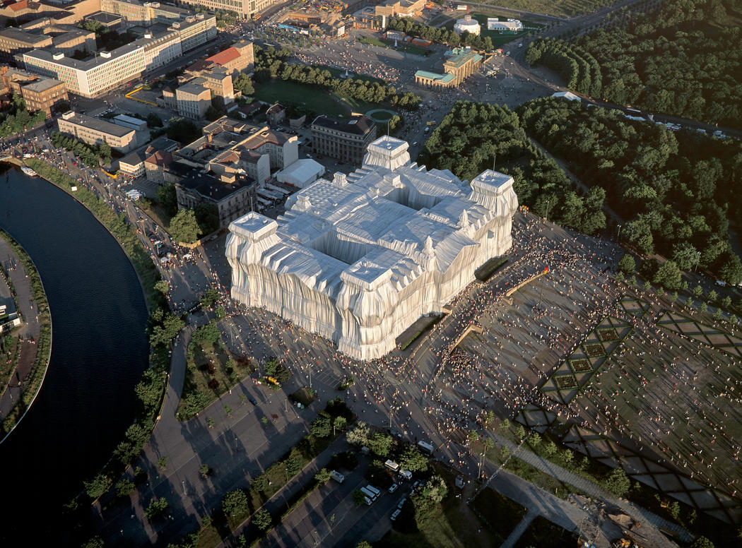
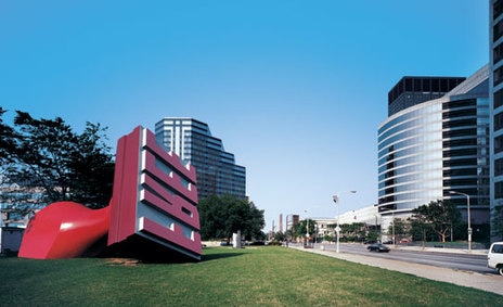
Wooden Chairs Istanbul This installation, produced for the 8th International Istanbul Biennial, contained approximately 1,550 wooden chairs stacked between two buildings to address a history of displacement. The work evokes the masses of faceless migrants that were displaced in Istanbul. A lot of people were forced to leave the city, leaving many empty sites. This piece was located on one such empty site. This compression of space and chaos of the chairs suggests that psychological but also physical state that many found themselves in. Another amazing thing about this work is the flat surface created to align perfectly with the front of the buildings. Therefore you have this bubbling, brewing kind of chaos behind a veneer of control. http://www3.mcachicago.org/2015/salcedo/works/untitled-istanbul/ Maya Lin Vietnam Veterans Memorial, 1982 Granite Washington DC Lin’s design called for the names of nearly 58,000 American servicemen, listed in chronological order of their loss, to be etched in a V-shaped wall of polished black granite sunken into the ground. Like the war itself, the monument proved controversial. Veterans groups decried the lack of patriotic or heroic symbols often seen on war memorials and complained that it seemingly honored only the fallen and not the living veterans. Some argued that the memorial should rise from the ground and not sink into the earth as if it was something to be hidden. After the memorial wall was unveiled on November 13, 1982, however, the controversy quickly subsided. When Lin first visited the proposed location for the memorial, she wrote, “I imagined taking a knife and cutting into the earth, opening it up, an initial violence and pain that in time would heal.” Her memorial proved to be a pilgrimage site for those who served in the war and those who had loved ones who fought in Vietnam. It became a sacred place of healing and reverence as she intended. Lin went on to design the Civil Rights Memorial in Montgomery, Alabama, and Yale University’s Women’s Table, which honors the first female students admitted to her alma mater. As the owner of her own New York City architectural studio, she designs a wide variety of structures from houses to museums to chapels. She is still best known, however, for that memorial design that earned her a B at Yale. Lin ultimately schooled her professor, who also entered the national design competition for the Vietnam Veterans Memorial and lost to his student. http://www.biography.com/news/maya-lin-vietnam-veterans-memorial Christo and Jeanne-Claude Wrapped Reichstag, 1995 Silver polypropylene fabric and blue ropes Berlin "Wrapped Reichstag," by Christo and his wife, Jean-Claude, is at once a work of art, a cultural event, a political happening and an ambitious piece of business. The immense project involved wrapping the 101-year-old German Parliament building in more than a million square feet of aluminum-colored fabric and 17,060 yards of bright blue rope holding it tight. The project was paid for by the artists, largely from the proceeds of the sale of the hundreds of drawings and collages of the wrapped Reichstag they made since the work was first conceived in the early 1970's. It required a huge staff of 210 construction workers, including 90 specially trained rock climbers; 17 office workers, and 600 "monitors," or guides, who answer questions and assist in crowd control. The project lay nearly dormant for 20 years until the fall of the Berlin wall and the reunification of Germany. At that time the government decided in 1991 to return the capital to Berlin, so Christo saw his chance to complete this project during a period of renovation. Christo and Jean-Claude say that their art is as much about process as product, which is why the notion of leaving it up for only two weeks does not disturb them. The entire work, in their view, is as much a study in the way attitudes are transformed over time as a pure object in itself. this immense stone hulk, a heavy, bombastic building that epitomizes German excesses of the late 19th century, is rendered light, almost delicate. It takes on an ethereal beauty, and looks as if it could float away into the silvery, cloudy Berlin sky. this huge structure covered in silver-gray fabric remains every bit as monumental as it was before -- perhaps more so, because the wrapping forces the eye to confront the Reichstag anew. The building is shimmering where it once was solid, refined where it once was gross and heavy. But it has lost none of its power. The wrapped version can almost be seen as an ideal symbol of the new Germany struggling to emerge from unification. The building was burned in 1933 by an arsonist thought to have been paid by the Nazis, who blamed the fire on the Communists and used it as an excuse to restrict civil liberties. Though Nazis used the Reichstag for propaganda exhibitions rather than as a capital, its capture by the Russians became a symbol of the Allies' victory in the Battle of Berlin that led to the German surrender at the end of World War II. christojeanneclaude.net/projects/wrapped-reichstag Claes Oldenburg & Coosje Van Bruggen Free Stamp, 1991 Steel, Aluminum, Polyurethane Enamel 28ft x 26ft x 49ft Willard Park (adjacent to Cleveland, OH City Hall) "The base on which the sculpture was originally to be situated was an area made of concrete that reminded us of a stamp pad. Associations followed and soon we had our subject: a colossal rubber stamp, an object then still common in the office culture of the surroundings. Our design made it necessary for us to select a short word to be "reproduced" by our stamp -- four letters at most. "Free," was chosen, a word with multiple implications. One could imagine that the Free Stamp had been picked up and thrown, landing on its side" http://oldenburgvanbruggen.com/largescaleprojects/lsp.htm |
Painted on the wall of the building: "An Homage to the unpaid and overworked artisans who have refined our sweet tastes from the cane fields to the kitchens of the new world on the occasion of the demolition of the domino sugar refining plant"
|
More Site-Specific Installation Artists: Research at least two different artists and compare the connections made between their use of materials, ideas, and locations for their sculptural works
|
Rachel Whiteread
|
Cildo Mereiles
|
Sol Lewitt
|
|
Andy Goldsworthy
|
Olafur Eliasson
|
Felix Gonzalez Torez
|
|
Emily Jacir
|
Song Dong
|
Mark Dion
|
|
Louise Borgeoise
|
Annette Messager
|
Hans Haacke
|
|
Daniel Buren
|
Ann Hamilton
|
John Ruppert
|
|
Gabriel Orozco
|
Richard Serra
|
Ai Wei Wei
|
Project Description: Create a site-specific work of art. What you make must have a relationship to the space in which it is installed. The piece should alter or contribute to our perception of that space or place.
Begin by thinking through any of these three main project components first:
1. Materials - Identify available resources and match these materials with a suitable theme and location
2. Ideas - Identify your theme and choose materials and a location that align with this idea
3. Places - Identify the location and design your idea and use of materials to support that particular place
|
Project Freedoms:
LOCATION
|
Project Constraints:
LOCATION
|
THIRD NINE WEEKS
Week 1-3: Unfinished Business
Choose one artwork that needs a significant amount of work to be considered finished. We will individual critiques for each of your selected pieces - you should take notes on your feedback to generate new journal pages. In your reflective investigation, be sure to outline not only how you are altering the piece, but why. Take progress photos for supporting visuals. Also, select a new artist ally to complete a critical investigation and explain how their work influences your own.
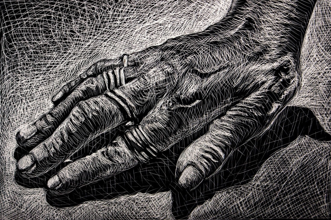
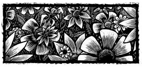
Week 4-6: Scratchboard
Although many examples of scratchboard art highlight a tremendous amount of skill and eloquent technique, they often completely lack conceptual qualities. Your concept for this next piece is your absolute priority. You need to communicate a specific message using relevant symbols that can get your viewer to understand the deeper meaning behind your work. This is your biggest challenge beyond the pure visual aspects of your design. How are you getting your viewer to think me deeply about what they're seeing?
|
|
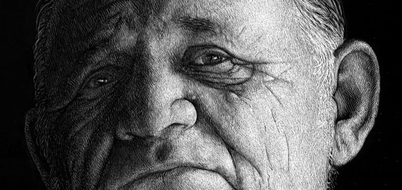
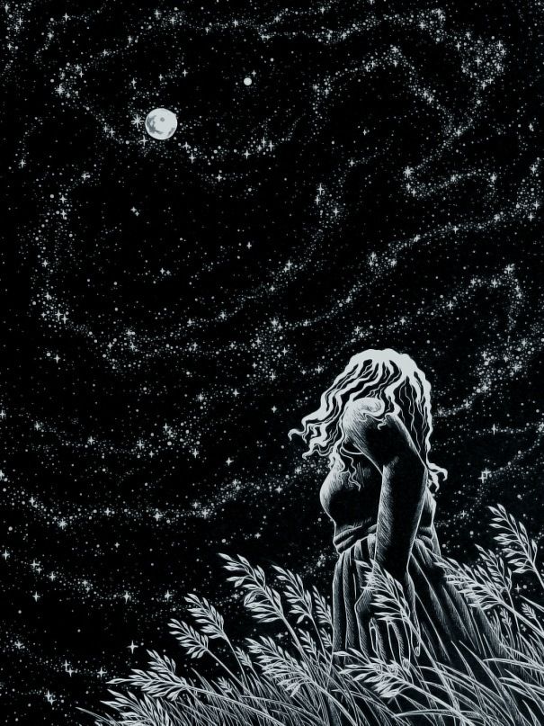
Scratchboard: How does it work?
The scratchboard surface starts out solid black. When you scratch it you get a white mark. If you’re lucky these white marks eventually end up creating a picture. A common mistake The first mistake people usually make is drawing everything with a white outline, like they would on a chalkboard. They don’t get the result they intended.

they often do this…
|
when what they really want is this…
|
|
In the second example you can see how black lines are made by scratching on either side of them. It’s a lot more work but the result is much better.
Start by pulling out the bright areas first. For example, in the cartoon above you could start first with the whites of the eyes, then the upper and lower eyelids, then the shape of the head, and finally, the background. When the highlighted shapes are revealed first, the lines take care of themselves. When you sketch with pencil or ink you usually start building up the shadows first. When working with scratchboard, you should start with the highlights first and then make your way toward the shadows. |
|
|
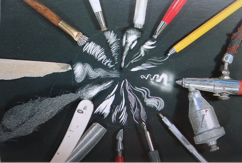
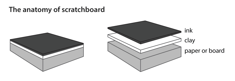
The diagram to the right shows a cross section of scratchboard that has been magnified and separated to show the layers. You don’t need special tools to get started with scratchboard. X-acto blades are commonly used, though there are specialized scratchboard points available. The tools you use will depend on your style and preferences. In the end, you just need a sharp object (usually metal) to put marks on the board.
|
|
Mistakes can be fixed!!
If you hear that this medium is unforgiving, it simply isn't true. Unless you scratch completely through to the white clay layer, mistakes can often be fixed easily. Even then, Ampersand makes kits to fix the clay as well.
The concept of scratchboard is scratching through the ink to reveal the white of the clay underneath. So, if you make a mistake, you just put that layer of black ink back on. Presto! All fixed. How do you put the ink back on? It can be applied with a brush, pen, or airbrush. The thinner the layer of ink, the easier it is to re-scratch.
Sandpaper
Sandpaper can be a real time saver, though it really depends on the type of work you do. If you need to take the ink off of fairly large areas, it does a nice job. It can be used, for instance, to get all the extra black off the borders of your illustration, which could be time consuming with a blade. Sandpaper can also help with some corrections. Sometimes when a scratchboard surface is re-inked the grooves left by the previous scratches give a bumpy look to any new scratches. When this happens, you can use a tiny piece of fine sandpaper to smooth the surface before re-inking, just be careful not to sand too much.
Transferring the drawing with Ball Point Pen Indentation
This is a method works with any paper-based scratchboard. To try it, place or tape your drawing on the scratchboard with the image face-up. Trace over the lines of the drawing with a fine ball-point pen. This leaves indented lines on the scratchboard that can’t get brushed away. When applying pressure be careful the drawing doesn’t shift.
Shading Techniques
Successful scratch art will contain a variety of line thickness to build up an object. Experiment with a variety of mark making and apply one or more of these techniques to rendering a simple form. Use these for media investigations in your journal.
|
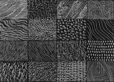
Examples of contour hatching and cross-hatching are shown below.
|
The finish
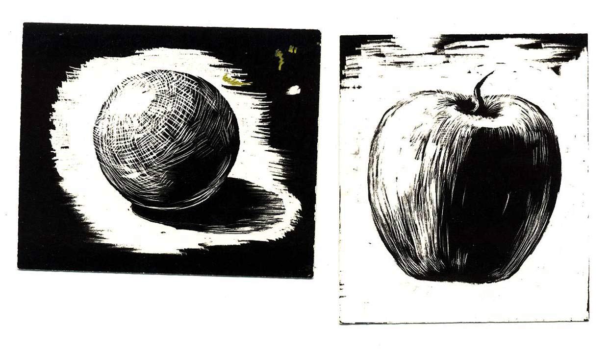
Once you have a drawing transferred, it is up to you to decide how to do the rendering. It is all a matter of style. Some artists use thick strokes, while others make tiny scratches. Some keep it very linear, while others like to crosshatch. Coming up with unique textures can make your work more interesting. Take a look at the work of other artists to see how they have solved the same problems you are facing.
Once you have a drawing transferred, it is up to you to decide how to do the rendering. It is all a matter of style. Some artists use thick strokes, while others make tiny scratches. Some keep it very linear, while others like to crosshatch. Coming up with unique textures can make your work more interesting. Take a look at the work of other artists to see how they have solved the same problems you are facing.
|
|
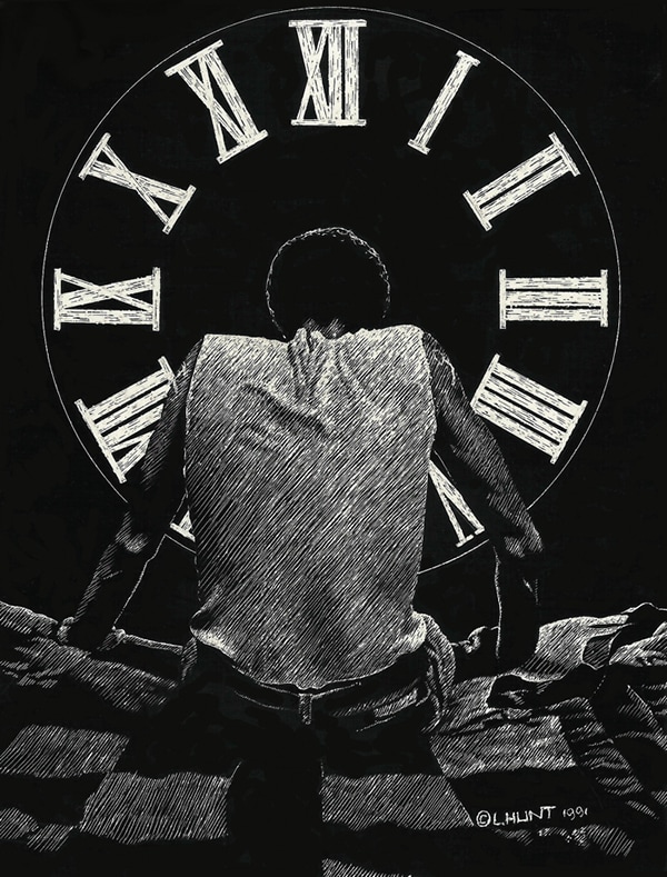
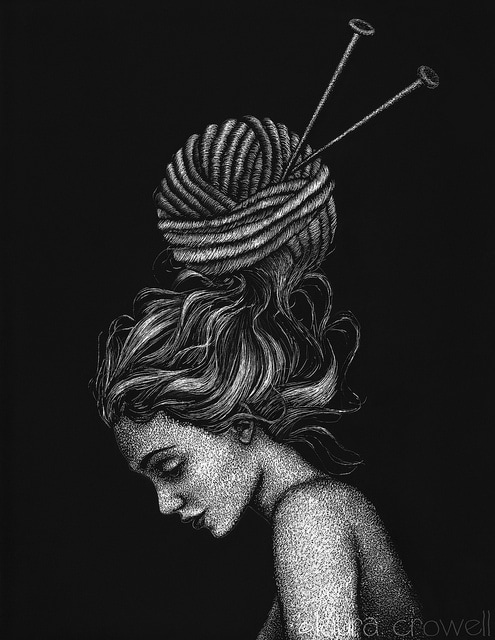
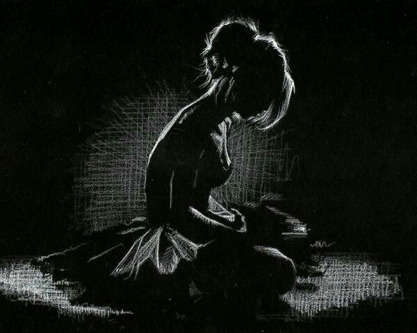
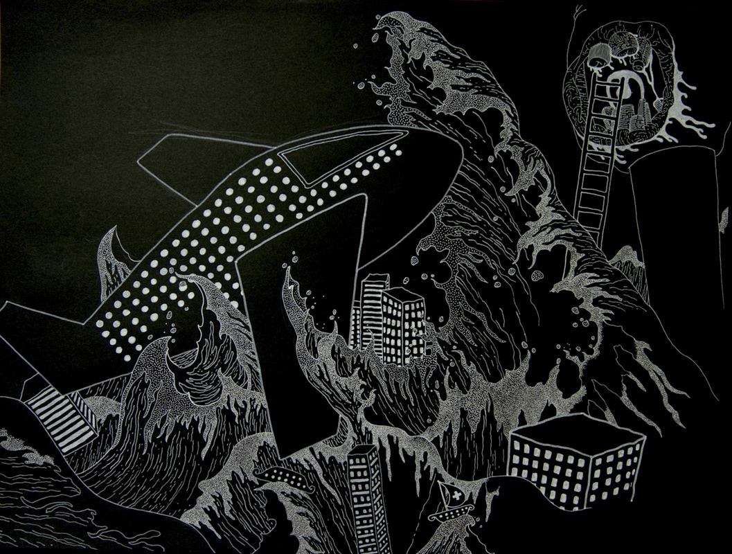
Drawing with White Media on Black Paper
Reverse DrawingUsing contrast in drawings is a great way to create a dynamic image. One way of creating good contrast is by using white material or media on dark or black surfaces. White media, of course, comes in many different forms. Ink, charcoal, oil pastels, chalk pastels, and colored pencils are all types of white media used for drawing. Combine this white media with a stark black background and you've got instant contrast. Strong contrast in a drawing usually leads to a dynamic and dramatic imagery.
Drawing with white material on black paper does require some getting used to. This is because most of us are accustomed to drawing with dark material on white or lightly colored paper. This thinking has ingrained in us the need to add dark values and leave the lighter values. When we reverse this thinking by drawing with white material on black paper, our process is the opposite.
Now, we must train our minds to deal with the lighter values and leave the darker values to the tone of the surface. This reversal can be challenging, but important in our development as artists. It forces us to recognize the importance of tints (lighter values) and their inherent relationships with shades (darker values). With practice, our understanding of value and how it is used to create drawings improves.
Drawing with white media on black paper can create stunning imagery and the drawing process itself can lead to improvement in your drawing ability.
|
|
|
|
SECOND NINE WEEKS
Week 1-3
Comparative Study Timeline
Part I: 8 Slides Due by Week 5_______/40pts + Sources_______/10pts
(Total = 50pts - 20% of Second Nine Weeks Grade)
Part II: 3 Process Portfolio Slides Due by Week 8_______/20pts
(separate graded component - goes at the very end of your Comparative Study)
Part II: 1 Final Portfolio Slide Due by Week 9_______/10pts
(separate graded component - goes at the very end of your Comparative Study)
Part II: Final Studio Project Due by Week 9_____/40pts
(separate graded component)
Part I: 7 Slides Due for on your Midterm Exam date________/40pts + Sources________/10pts
(Total = 50pts - 1/7th of First Semester Grade)
| comparativestudyrequirementsandgrading.docx |
Comparative Study Resources
What exactly IS required for the CS?SL 10-15 pages (screens)
HL 10-15 Pages ( screens) + 3-5 Pages (screens) which analyze the extent to which their work has been influenced by the art and artists examined. The pages submitted must examine and compare at least three artworks at least two of which need to be by different artists. The work selected for comparison should come from contrasting contexts (local, national, international and/or intercultural). Ideally students should see one of the works firsthand.
Comparative Study examples and evaluations
Comparative Study Clarifications
Why do we create?
In the Comparative Study,one of the assessed criteria, Criterion B. Interpreting Function and Purpose may be new or confusing.
Function and purpose is a fancy way of saying, what is it made for? Some art works have a very clear purpose: a designed object, such as a chair or a vessel has a practical function as well as a decorative function. You have probably seen many examples of art with a religious purpose, or a narrative purpose (telling a story, as in history painting), and art that has a mainly personal, expressive function. Some art functions as a status symbol, conferring power or wealth to the owner, and there is work that is created with the intent to shock or disturb.
Function and purpose is a fancy way of saying, what is it made for? Some art works have a very clear purpose: a designed object, such as a chair or a vessel has a practical function as well as a decorative function. You have probably seen many examples of art with a religious purpose, or a narrative purpose (telling a story, as in history painting), and art that has a mainly personal, expressive function. Some art functions as a status symbol, conferring power or wealth to the owner, and there is work that is created with the intent to shock or disturb.
THESE ARE SOME COMMON FUNCTIONS IN ART:
- PERSONAL / EXPRESSIVE FUNCTION: TO EXPRESS PERSONAL FEELINGS. PERHAPS THE ARTIST WANTED TO REMIND VIEWERS OF PERSONAL FAMILY TRAGEDY, OR PERHAPS HE JUST WANTED TO TELL THEM TO APPRECIATE WHAT THEY HAD, AND TO LIVE EACH DAY AS IF IT WERE THEIR LAST.
- SOCIAL / POLITICAL FUNCTION: TO REINFORCE AND ENHANCE THE SHARED SENSE OF IDENTITY OF THOSE IN FAMILY, COMMUNITY, OR CIVILIZATION, FOR EXAMPLE, FESTIVE OCCASIONS, PARADES, DANCES, UNIFORMS, IMPORTANT HOLIDAYS OR EVENTS - SERVES A POLITICAL PURPOSE SUCH AS PROPAGANDA
- SPIRITUAL / RELIGIOUS FUNCTION: TO EXPRESS SPIRITUAL BELIEFS ABOUT THE DESTINY OF LIFE CONTROLLED BY THE FORCE OF A HIGHER POWER - TO TELL A RELIGIOUS STORY OR SERVE AS ON OBJECT OF DEVOTION
- EDUCATIONAL FUNCTION: SYMBOLS AND SIGNS TO ILLUSTRATE KNOWLEDGE NOT GIVEN IN WORDS
- POLITICAL FUNCTION: TO REINFORCE AND ENHANCE A SENSE OF IDENTITY AND IDEOLOGICAL CONNECTION TO SPECIFIC POLITICAL VIEWS, PARTIES AND/OR PEOPLE.
- PRACTICAL / PHYSICAL FUNCTION: TO SERVE A PRACTICAL USE< SUCH S CLOTHING VESSELS, FURNITURE, BUILDINGS
- DESCRIPTIVE FUNCTION: TO RECORD THE LIKENESS OF A PERSON PLACE OR THING
- CONCEPTUAL FUNCTION: THE IDEA OR CONCEPT BEHIND THE WORK IS MORE IMPORTANT THAN THE OBJECT ITSELF
- HISTORICL / NARRATIVE FUNCTION: TO TELL A STORY OF AN EVENT IN HISTORY
- COMMEMORATIVE FUNCTION: MADE TO HONOR SOMEONE ( LIKE A MEMORIAL)
- SYMBOLIC FUNCTION: SYMBOLIZES CERTAIN BELIEFS OR IDEAS WITHOUT REPRESENTING THEM
- DECORACTIVE FUNCTION: USED TO ADORN THE BODY, A ROOM, BUILDING, ETC.
- RITUAL FUNCTION: USED AS PART OF A RITUAL OR CERMEONY (MAY HAVE MAGICAL POWERS)
- SHOCK FUNCTION: INTENDED TO DISTURB OR UPSET THE VIEWER
Functions in Art Video
Week 4-9
Creative Ceramics
| creative_ceramics.docx |
Design Teams (Split into groups of 6)
Identify, describe and justify the two functions this ceramics piece will serve.
Explain the connection this piece has to the rest of your portfolio.
Determine one or more ways to modify your design based on group feedback.
Identify, describe and justify the two functions this ceramics piece will serve.
Explain the connection this piece has to the rest of your portfolio.
Determine one or more ways to modify your design based on group feedback.

FIRST NINE WEEKS
Week 1
Impromptu Curating Activity:
Curate comes from Latin: curare meaning "take care"; to curate is to oversee and care for a collection.
Objective: Curating, presenting and articulating intention will be an important part of the final exhibition assessment
Assignment: Choose three summer pieces that work together visually or thematically - you may not include more than one piece from the same artist (including yourself) - you must have more than one media represented in your exhibit - spend some time with the three pieces and list some of the similarities and differences among the works - invent a creative title for your exhibit and place it on the wall next to your display - you will introduce this work to the class to open the discussion about your collection
FRI 9/9 - Summer Work Critique: Your Roles: Curator, Buyer, Audience
Week 2
TUE 9/13 - Complete Summer Work Critique
THU 9/15 - What is creativity? Where does it come from? Who needs creativity to succeed? What are the biggest barriers to creativity?
THU 9/15 - What is creativity? Where does it come from? Who needs creativity to succeed? What are the biggest barriers to creativity?
What is happening in our schools that is killing creativity? - Article: Cognitive Laziness Inhibits Creativity
What is happening in the art room that encourages creativity? - Video: Ken Robinson: Universal Language
What is happening in the art room that encourages creativity? - Video: Ken Robinson: Universal Language
Creative Thinking Challenge
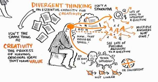
Creativity and the Brain: Convergent vs. Divergent Thinking
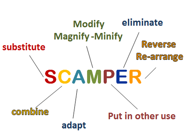
Kickstarting Creative Thinking with SCAMPER
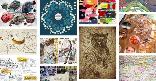
Creative Mind Mapping - Examples
Week 3
MON 9/19 - Complete Mind Maps
WED 9/21 - Share ideas and take notes to develop project further
FRI 9/23 - Finish sharing ideas and review project proposal
WED 9/21 - Share ideas and take notes to develop project further
FRI 9/23 - Finish sharing ideas and review project proposal
Week 4
TUE 9/27 - Submit Scamper Proposal
| scamperprojectproposal.doc.docx |
Week 5
| refuge.docx |

MON 10/3 - Review At-Home Assignment: Where is your refuge?
Contine In-Class Assignment (Scamper): Complete media experiments - Move to final surface design
6 Journal pages due to be graded @ 8:30am (Mind map = 2 pages + 2 Critical + 1 Media + 1 Contextual Investigation
JOURNAL CRITERIA: (5pts per page = 30pts total)
A. Type of Investigation (2pts): Conceptual, Media, Critical, Contextual, or ReflectiveB. Visual Presentation (1pt)
- Highly effective balance of text and imagery
- Clear, legible and organized layout
- Confident and coherent articulation of ideas
- Meaningful and insightful reflections
- Accurate and appropriate use of subject-specific language
- Each page is numbered with a unique heading, image captions, and citations
WED 10/5 - Studio Time - share struggles to compile resources
FRI 10/7 - Complete 3 Process Portfolio Slides
#1 = Scamper: Mindmap
#2 = Scamper: 2 Critical Investigations
#3 = Scamper: Media + Contextual Investigation (OR Reflective Investigation - not completed yet)
PROCESS PORTFOLIO SLIDE CRITERIA: 3 slides = 20pts
A. Skills, techniques and processes (4pts)
FRI 10/7 - Complete 3 Process Portfolio Slides
#1 = Scamper: Mindmap
#2 = Scamper: 2 Critical Investigations
#3 = Scamper: Media + Contextual Investigation (OR Reflective Investigation - not completed yet)
PROCESS PORTFOLIO SLIDE CRITERIA: 3 slides = 20pts
A. Skills, techniques and processes (4pts)
- Include Media Investigation pages
- Add supporting visuals and text to explain and elaborate on your investigations
- Include Critical and/or Contextual Investigation pages
- Add supporting visuals and text to explain and elaborate on your investigations
- Include Conceptual and/or Contextual Investigation pages
- Add supporting visuals and text to explain and elaborate on your investigations
- IncludeReflective Invesigation pages
- Add supporting visuals and text to explain and elaborate on your investigations
- Each slide must have its own unique heading with proper captions on every image and citations included for all outside information
- Focus on legibility and ensure formatting is both consistent and appropriate
Week 6
TUE 10/11 - Studio Time
THU 10/13 - Studio Time
Refuge Checkpoint - 2 Journal Pages (Conceptual + 1 other investigation)
THU 10/13 - Studio Time
Refuge Checkpoint - 2 Journal Pages (Conceptual + 1 other investigation)
Week 7
MON 10/17 - Studio Time
WED 10/19 - Studio Time
FRI 10/21 - Refuge Checkpoint - 2 more Journal Pages (Media with process photos + 1 other investigation)
WED 10/19 - Studio Time
FRI 10/21 - Refuge Checkpoint - 2 more Journal Pages (Media with process photos + 1 other investigation)
Week 8
TUE 10/25 - Studio Time
THU 10/27 - Final 3 Process Portfolio Slides (Early Release) - Any pages not completed at this point must be inserted on the slides no later than Monday @ 8:30am
#4 = Refuge: Conceptual + Critical Investigation (if more closely aligned with artist's thinking process) OR Reflective Investigation
#5 = Refuge: Media + Critical Investigation (if more closely aligned with artist's material process) OR Reflective Investigation
#6 = CHOOSE 1 Contextual Investigation (Scamper or Refuge)
PROCESS PORTFOLIO SLIDE CRITERIA: (3 slides = 20pts)
A. Skills, techniques and processes (4pts)
- Include Media Investigation pages
- Add supporting visuals and text to explain and elaborate on your investigations
- Include Critical and/or Contextual Investigation pages
- Add supporting visuals and text to explain and elaborate on your investigations
- Include Conceptual and/or Contextual Investigation pages
- Add supporting visuals and text to explain and elaborate on your investigations
- Include Reflective Invesigation pages
- Add supporting visuals and text to explain and elaborate on your investigations
- Each slide must have its own unique heading with proper captions on every image and citations included for all outside information
- Focus on legibility and ensure formatting is both consistent and appropriate
Week 9
MON 10/31 - Final Critique Part I
6 Journal Pages Due @ 8:30 am
JOURNAL CRITERIA: (5pts per page = 30pts total)
A. Type of Investigation (2pts): Conceptual, Media, Critical, Contextual, or ReflectiveB. Visual Presentation (1pt)
WED 11/2 - Final Critique Part II
FRI 11/4 - Final Portfolio Slides (Early Release)
Final Portfolio Slide Requirements:
2 slides (1 for each studio piece) Worth 20 pts each = 40pts total
SLIDE CRITERIA: (40pts)
D. Final Porfolio Slides (10pts each)
Prepares work to be photographed upon completion
Inserts image onto Final Portfolio Slide
Includes Title, Media, and Size (rounded centimeters) on the Final Portfolio Slide
Writes the Exhibition Text to explain artistic intentions (500 characters w/ spaces max)
6 Journal Pages Due @ 8:30 am
JOURNAL CRITERIA: (5pts per page = 30pts total)
A. Type of Investigation (2pts): Conceptual, Media, Critical, Contextual, or ReflectiveB. Visual Presentation (1pt)
- Highly effective balance of text and imagery
- Clear, legible and organized layout
- Confident and coherent articulation of ideas
- Meaningful and insightful reflections
- Accurate and appropriate use of subject-specific language
- Each page is numbered with a unique heading, image captions, and citations
WED 11/2 - Final Critique Part II
FRI 11/4 - Final Portfolio Slides (Early Release)
Final Portfolio Slide Requirements:
2 slides (1 for each studio piece) Worth 20 pts each = 40pts total
SLIDE CRITERIA: (40pts)
D. Final Porfolio Slides (10pts each)
Prepares work to be photographed upon completion
Inserts image onto Final Portfolio Slide
Includes Title, Media, and Size (rounded centimeters) on the Final Portfolio Slide
Writes the Exhibition Text to explain artistic intentions (500 characters w/ spaces max)
